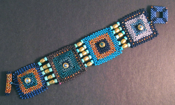
I am in the process of designing and creating samples for my upcoming shows. I realized last week that I had 4 groups, but none of them really featured BLUE. I gave myself a few days to come up with a palette that balanced with the other color palettes that I had already done, and I came up with Lapis/Blue. It is rich and saturated with a nod to Ancient Egyptian jewelry and faience. I’m working with purple-y blues and lobelia, turquoises, navy, lavender, and shades of metallic gold. This is the first piece I have made and now I want to keep making more and more with this palette. It’s calming and deep and mysterious- and looks good on lots of people.
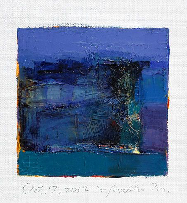
This little painting by Hiroshi Matsumoto is my color inspiration.


